Back to Home
Looply.
UX Design.
Visual Systems.
Ed - Tech.
Designing an assessment experience students might actually want to come back to.

Product Thinking
Turned a broad assessment brief into a learning-focused product direction built around curiosity rather than obligation.
UX & Interaction
Designed assignment prioritisation, assessment flows, uncertainty-saving, review navigation, and feedback loops.
Visual Language
Built the interface language, semantic state system, typography hierarchy, reusable components, and interaction states.
Quick Navigation.
Overview.
Most assessment platforms are designed to measure learning. Very few are designed to encourage it.
This project started with a simple observation and one question worth exploring.
“What if completing an assessment felt less like a task, and more like part of learning?”
Every time I thought it was done, I'd open it again and find something that didn't sit right. That cycle became the most honest design process I've had. Looply started from a pattern I kept noticing in edtech: assessment experiences built for institutions, not students. Products you complete because skipping them has consequences, not because you're curious about what comes next. That pattern became the problem I wanted to solve.
The Problem.
Obligation isn't a product strategy.
I thought back to every mandatory assessment I took during college placement prep. Timed. Transactional. Designed to measure, not engage. I got through them because I had to. Then I thought about Duolingo. Three years of using it. No grade. No consequence for stopping. Yet I kept returning because the experience made me curious about what came next.
Todavía no hablo español... pero sigo volviendo
The gap between those two experiences became the design question. The problem wasn't that edtech assessments looked bad. It was that they felt like a task. Every interaction asked, "How quickly can you get through this?" instead of "What did you just learn?" One principle guided everything that followed:
Reduce cognitive effort. Increase curiosity.
Design Principle.
Learning shouldn't end when the assessment does.
An assessment measures performance. A learning product should explain it. Every decision in Looply was driven by a single question: does this help the student understand what just happened, or am I simply showing them a score?
Whenever I wasn't sure whether to surface information or hide it, I came back to the same principle. If something reduced cognitive effort, clarified the next action, or encouraged reflection, it stayed. If it existed only because "assessment platforms usually have it," it didn't.
The Decisions.
Four decisions that changed the experience.
Decision 01
Urgency comes to you.
Students had to navigate into the assignment list just to discover what needed their attention. For the most time-sensitive action in the app, that order felt backwards.
A persistent floating action button surfaces pending assignments directly from the home screen. Tapping it opens a bottom sheet with the three most urgent tasks, ordered by deadline. No navigation. No scrolling. The next action finds the student instead of asking the student to find it.
The shortest path to starting work should always be the easiest one.

Decision 02
Performance should be visible before it's readable.
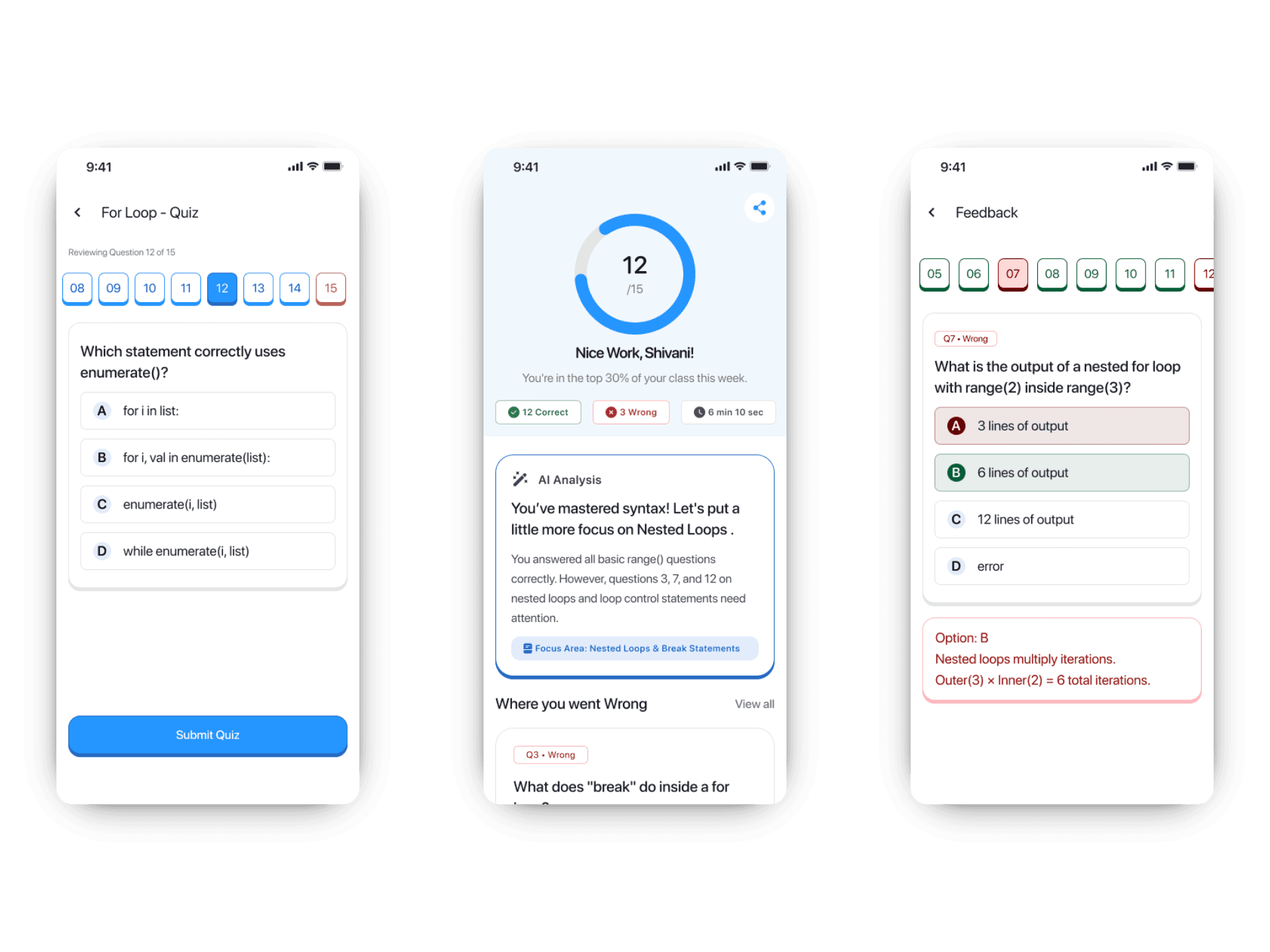
The original review grid only distinguished answered and unanswered questions. After completing an assessment, that same structure failed to communicate how the student had actually performed.
The redesigned state system turns the grid into a performance overview. Correct, incorrect, saved, and active questions are visually distinct, allowing students to understand the shape of their performance before opening a single question.
Color never carries meaning alone. Each state is reinforced through labels, borders, and contextual feedback, allowing the system to remain understandable without relying on color perception alone.
Understanding should happen before analysis begins.
Decision 03
Correct doesn't always mean understood.
Most assessment platforms explain mistakes. They ignore a more interesting case: the answers students guessed correctly.
That gap led to the Save feature. A bookmark lets students flag uncertainty while answering without interrupting their flow. Saved questions become their own review category, making it easier to revisit concepts they answered correctly for the wrong reasons. The product shifts from measuring performance to strengthening understanding.
A correct answer isn't always evidence of learning.

Decision 04
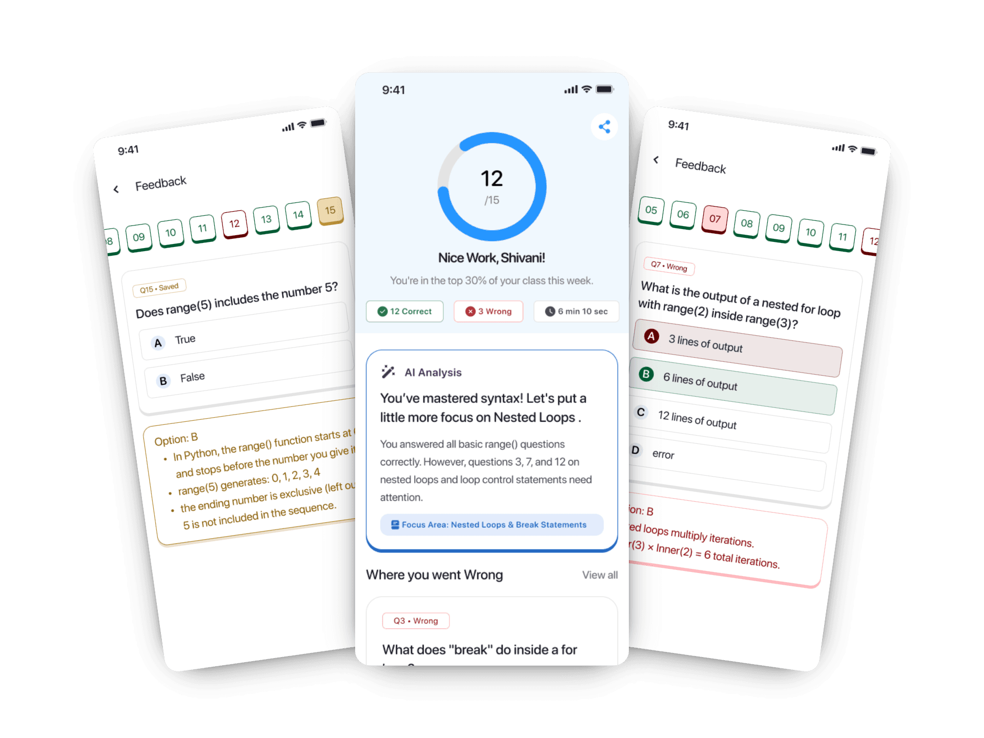
Feedback should end with understanding, not scores.
Early versions of the results screen surfaced only incorrect and skipped answers. Once students reviewed those, the experience ended, leaving no easy way to revisit correct answers, saved questions, or broader performance patterns.
A dedicated View All experience completes the feedback loop. Every question becomes accessible from a single interactive overview, allowing students to review correct, incorrect, skipped, and saved responses alongside their explanations. The assessment no longer ends with a score. It ends with clarity.
Every question deserves the opportunity to become a learning moment.
Interface.
The experience, end to end.
01 / Home
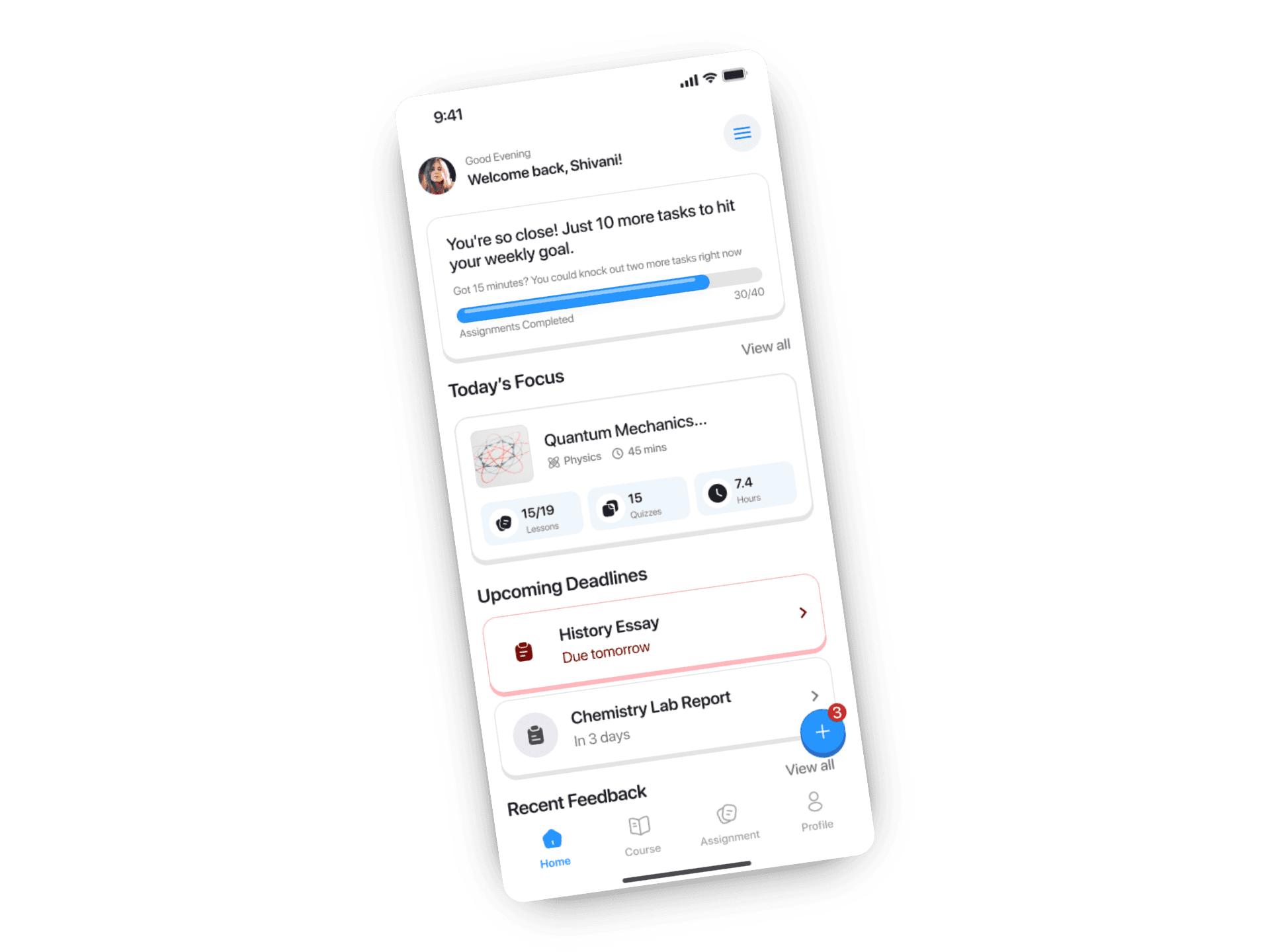
From knowing what needs attention to getting it done.
02 / Assignments & Assesments

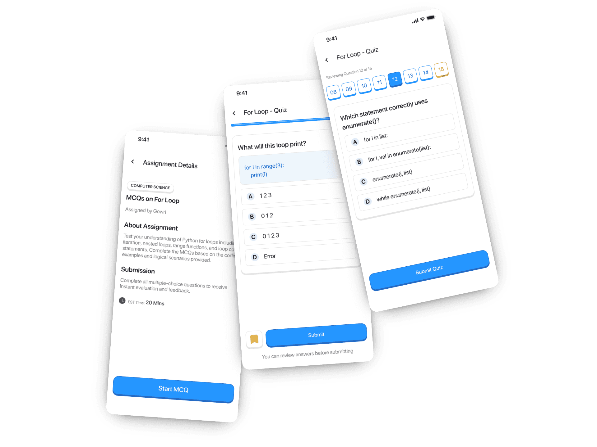
Focused while answering. Flexible when uncertainty appears.
03 / Feedback & Learning

The assessment ends. The learning doesn’t.
Style Guide.
Blue
Primary blue is reserved for actions, navigation, and active states. Its consistency makes interactive elements predictable without requiring additional explanation.
SF Pro Rounded
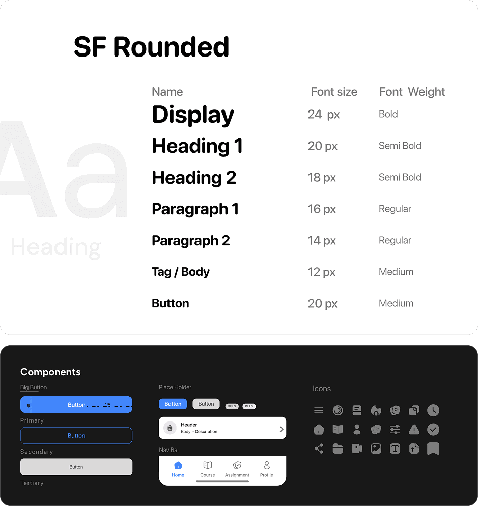
Looply is designed for students, but it doesn’t need to look like a children’s app. SF Pro Rounded softens the interface while maintaining clarity at mobile scale.
Pri- blue
#4386FB
Success
#005A34
Error
#720101
Text
#1B1B23
BG
#FFFFFF
A
a
Heading
SF Rounded
Name
Font size
Font Weight
Display
24 px
Bold
Heading 1
20 px
Semi Bold
Heading 2
18 px
Semi Bold
Paragraph 1
16 px
Regular
Paragraph 2
14 px
Regular
Tag / Body
12 px
Medium
Button
20 px
Medium
Components
Primary
Secondary
Tertiary
Big Button
40
Button
Button
Button
Place Holder
Button
Button
PIlls
Pills
Header
Body • Description
Nav Bar
Home
Course
Assignment
Profile
Icons
Learnings.
The principle did the work.
“Reduce cognitive effort. Increase curiosity.” started as a direction, but became the filter for almost every decision. When I wasn’t sure whether something deserved attention, another interaction, or another screen, I came back to that sentence. A good principle doesn’t decorate the process. It reduces the number of arbitrary decisions you have to make.
Correct isn’t the same as understood.
The Save feature came from noticing a gap I wasn’t originally looking for: a student can guess correctly and the system treats it exactly like genuine understanding. Designing for uncertainty changed how I thought about assessment feedback. Performance tells you what happened. Good feedback should help explain why.
Don’t redesign what already works.
Not every familiar pattern needs a creative alternative. The basic quiz interaction was already understandable, so I kept it familiar and focused my effort on what happened around it: uncertainty, review, feedback, and what comes next. Novelty is useful only when it solves something.
I kept returning to it.
This project went through more iterations than I planned because I kept noticing things that felt unresolved. That became strangely appropriate for a product built around encouraging students to return, reflect, and understand a little more each time.
The product became Looply because the process was a loop too.
Conclusion.
The assessment ends. The learning shouldn’t.
Looply started with a simple question: what if assessments were designed not only to measure students, but to help them understand themselves?
The final experience makes urgency easier to act on, uncertainty worth revisiting, and feedback useful beyond the score. Students can see what went wrong, return to what they weren’t sure about, and leave knowing where to focus next.
I didn’t try to make assessments fun. That would be a suspiciously ambitious claim. I tried to make them feel less like an obligation and more like part of learning.
The score closes the assessment. Understanding closes the loop.
Always Open to Meaningful Conversation!
Open to roles, collaborations, and conversations.
Designed with curiosity. Built through iteration. Still questioning everything.
© 2026 Senthil Nathan.
Back to Home
Looply.
UX Design.
Visual Systems.
Ed - Tech.
Designing an assessment experience students might actually want to come back to.
Product Thinking
Turned a broad assessment brief into a learning-focused product direction built around curiosity rather than obligation.
UX & Interaction
Designed assignment prioritisation, assessment flows, uncertainty-saving, review navigation, and feedback loops.
Visual Language
Built the interface language, semantic state system, typography hierarchy, reusable components, and interaction states.
Quick Navigation.
Overview.
Most assessment platforms are designed to measure learning. Very few are designed to encourage it.
This project started with a simple observation and one question worth exploring.
“What if completing an assessment felt less like a task, and more like part of learning?”
Every time I thought it was done, I'd open it again and find something that didn't sit right. That cycle became the most honest design process I've had. Looply started from a pattern I kept noticing in edtech: assessment experiences built for institutions, not students. Products you complete because skipping them has consequences, not because you're curious about what comes next. That pattern became the problem I wanted to solve.
The Problem.
Obligation isn't a product strategy.
I thought back to every mandatory assessment I took during college placement prep. Timed. Transactional. Designed to measure, not engage. I got through them because I had to. Then I thought about Duolingo. Three years of using it. No grade. No consequence for stopping. Yet I kept returning because the experience made me curious about what came next.
Todavía no hablo español... pero sigo volviendo
The gap between those two experiences became the design question. The problem wasn't that edtech assessments looked bad. It was that they felt like a task. Every interaction asked, "How quickly can you get through this?" instead of "What did you just learn?" One principle guided everything that followed:
Reduce cognitive effort. Increase curiosity.
Design Principle.
Learning shouldn't end when the assessment does.
An assessment measures performance. A learning product should explain it. Every decision in Looply was driven by a single question: does this help the student understand what just happened, or am I simply showing them a score?
Whenever I wasn't sure whether to surface information or hide it, I came back to the same principle. If something reduced cognitive effort, clarified the next action, or encouraged reflection, it stayed. If it existed only because "assessment platforms usually have it," it didn't.
The Decisions.
Four decisions that changed the experience.
Decision 01
Urgency comes to you.
Students had to navigate into the assignment list just to discover what needed their attention. For the most time-sensitive action in the app, that order felt backwards.
A persistent floating action button surfaces pending assignments directly from the home screen. Tapping it opens a bottom sheet with the three most urgent tasks, ordered by deadline. No navigation. No scrolling. The next action finds the student instead of asking the student to find it.
The shortest path to starting work should always be the easiest one.
Decision 02
Performance should be visible before it's readable.
The original review grid only distinguished answered and unanswered questions. After completing an assessment, that same structure failed to communicate how the student had actually performed.
The redesigned state system turns the grid into a performance overview. Correct, incorrect, saved, and active questions are visually distinct, allowing students to understand the shape of their performance before opening a single question.
Color never carries meaning alone. Each state is reinforced through labels, borders, and contextual feedback, allowing the system to remain understandable without relying on color perception alone.
Understanding should happen before analysis begins.
Decision 03
Correct doesn't always mean understood.
Most assessment platforms explain mistakes. They ignore a more interesting case: the answers students guessed correctly.
That gap led to the Save feature. A bookmark lets students flag uncertainty while answering without interrupting their flow. Saved questions become their own review category, making it easier to revisit concepts they answered correctly for the wrong reasons. The product shifts from measuring performance to strengthening understanding.
A correct answer isn't always evidence of learning.
Decision 04
Feedback should end with understanding, not scores.
Early versions of the results screen surfaced only incorrect and skipped answers. Once students reviewed those, the experience ended, leaving no easy way to revisit correct answers, saved questions, or broader performance patterns.
A dedicated View All experience completes the feedback loop. Every question becomes accessible from a single interactive overview, allowing students to review correct, incorrect, skipped, and saved responses alongside their explanations. The assessment no longer ends with a score. It ends with clarity.
Every question deserves the opportunity to become a learning moment.
Interface.
The experience, end to end.
01 / Home
From knowing what needs attention to getting it done.
02 / Assignments & Assesments
Focused while answering. Flexible when uncertainty appears.
03 / Feedback & Learning
The assessment ends. The learning doesn’t.
Style Guide.
Blue
Primary blue is reserved for actions, navigation, and active states. Its consistency makes interactive elements predictable without requiring additional explanation.
SF Pro Rounded
Looply is designed for students, but it doesn’t need to look like a children’s app. SF Pro Rounded softens the interface while maintaining clarity at mobile scale.
Pri- blue
#4386FB
Success
#005A34
Error
#720101
Text
#1B1B23
BG
#FFFFFF
A
a
Heading
SF Rounded
Name
Font size
Font Weight
Display
24 px
Bold
Heading 1
20 px
Semi Bold
Heading 2
18 px
Semi Bold
Paragraph 1
16 px
Regular
Paragraph 2
14 px
Regular
Tag / Body
12 px
Medium
Button
20 px
Medium
Components
Primary
Secondary
Tertiary
Big Button
40
Button
Button
Button
Place Holder
Button
Button
PIlls
Pills
Header
Body • Description
Nav Bar
Home
Course
Assignment
Profile
Icons
Learnings.
The principle did the work.
“Reduce cognitive effort. Increase curiosity.” started as a direction, but became the filter for almost every decision. When I wasn’t sure whether something deserved attention, another interaction, or another screen, I came back to that sentence. A good principle doesn’t decorate the process. It reduces the number of arbitrary decisions you have to make.
Correct isn’t the same as understood.
The Save feature came from noticing a gap I wasn’t originally looking for: a student can guess correctly and the system treats it exactly like genuine understanding. Designing for uncertainty changed how I thought about assessment feedback. Performance tells you what happened. Good feedback should help explain why.
Don’t redesign what already works.
Not every familiar pattern needs a creative alternative. The basic quiz interaction was already understandable, so I kept it familiar and focused my effort on what happened around it: uncertainty, review, feedback, and what comes next. Novelty is useful only when it solves something.
I kept returning to it.
This project went through more iterations than I planned because I kept noticing things that felt unresolved. That became strangely appropriate for a product built around encouraging students to return, reflect, and understand a little more each time.
The product became Looply because the process was a loop too.
Conclusion.
The assessment ends. The learning shouldn’t.
Looply started with a simple question: what if assessments were designed not only to measure students, but to help them understand themselves?
The final experience makes urgency easier to act on, uncertainty worth revisiting, and feedback useful beyond the score. Students can see what went wrong, return to what they weren’t sure about, and leave knowing where to focus next.
I didn’t try to make assessments fun. That would be a suspiciously ambitious claim. I tried to make them feel less like an obligation and more like part of learning.
The score closes the assessment. Understanding closes the loop.
Always Open to Meaningful Conversation!
Open to roles, collaborations, and conversations.
Designed with curiosity. Built through iteration. Still questioning everything.
© 2026 Senthil Nathan.
Back to Home
Looply.
UX Design.
Visual Systems.
Ed - Tech.
Designing an assessment experience students might actually want to come back to.

Product Thinking
Turned a broad assessment brief into a learning-focused product direction built around curiosity rather than obligation.
UX & Interaction
Designed assignment prioritisation, assessment flows, uncertainty-saving, review navigation, and feedback loops.
Visual Language
Built the interface language, semantic state system, typography hierarchy, reusable components, and interaction states.
Quick Navigation.
Overview.
Most assessment platforms are designed to measure learning. Very few are designed to encourage it.
This project started with a simple observation and one question worth exploring.
“What if completing an assessment felt less like a task, and more like part of learning?”
Every time I thought it was done, I'd open it again and find something that didn't sit right. That cycle became the most honest design process I've had. Looply started from a pattern I kept noticing in edtech: assessment experiences built for institutions, not students. Products you complete because skipping them has consequences, not because you're curious about what comes next. That pattern became the problem I wanted to solve.
The Problem.
Obligation isn't a product strategy.
I thought back to every mandatory assessment I took during college placement prep. Timed. Transactional. Designed to measure, not engage. I got through them because I had to. Then I thought about Duolingo. Three years of using it. No grade. No consequence for stopping. Yet I kept returning because the experience made me curious about what came next.
Todavía no hablo español... pero sigo volviendo
The gap between those two experiences became the design question. The problem wasn't that edtech assessments looked bad. It was that they felt like a task. Every interaction asked, "How quickly can you get through this?" instead of "What did you just learn?" One principle guided everything that followed:
Reduce cognitive effort. Increase curiosity.
Design Principle.
Learning shouldn't end when the assessment does.
An assessment measures performance. A learning product should explain it. Every decision in Looply was driven by a single question: does this help the student understand what just happened, or am I simply showing them a score?
Whenever I wasn't sure whether to surface information or hide it, I came back to the same principle. If something reduced cognitive effort, clarified the next action, or encouraged reflection, it stayed. If it existed only because "assessment platforms usually have it," it didn't.
The Decisions.
Four decisions that changed the experience.
Decision 01
Urgency comes to you.
Students had to navigate into the assignment list just to discover what needed their attention. For the most time-sensitive action in the app, that order felt backwards.
A persistent floating action button surfaces pending assignments directly from the home screen. Tapping it opens a bottom sheet with the three most urgent tasks, ordered by deadline. No navigation. No scrolling. The next action finds the student instead of asking the student to find it.
The shortest path to starting work should always be the easiest one.
Decision 02
Performance should be visible before it's readable.
The original review grid only distinguished answered and unanswered questions. After completing an assessment, that same structure failed to communicate how the student had actually performed.
The redesigned state system turns the grid into a performance overview. Correct, incorrect, saved, and active questions are visually distinct, allowing students to understand the shape of their performance before opening a single question.
Color never carries meaning alone. Each state is reinforced through labels, borders, and contextual feedback, allowing the system to remain understandable without relying on color perception alone.
Understanding should happen before analysis begins.
Decision 03
Correct doesn't always mean understood.
Most assessment platforms explain mistakes. They ignore a more interesting case: the answers students guessed correctly.
That gap led to the Save feature. A bookmark lets students flag uncertainty while answering without interrupting their flow. Saved questions become their own review category, making it easier to revisit concepts they answered correctly for the wrong reasons. The product shifts from measuring performance to strengthening understanding.
A correct answer isn't always evidence of learning.
Decision 04
Feedback should end with understanding, not scores.
Early versions of the results screen surfaced only incorrect and skipped answers. Once students reviewed those, the experience ended, leaving no easy way to revisit correct answers, saved questions, or broader performance patterns.
A dedicated View All experience completes the feedback loop. Every question becomes accessible from a single interactive overview, allowing students to review correct, incorrect, skipped, and saved responses alongside their explanations. The assessment no longer ends with a score. It ends with clarity.
Every question deserves the opportunity to become a learning moment.
Interface.
The experience, end to end.
01 / Home
From knowing what needs attention to getting it done.
02 / Assignments & Assesments
Focused while answering. Flexible when uncertainty appears.
03 / Feedback & Learning
The assessment ends. The learning doesn’t.
Style Guide.
Blue
Primary blue is reserved for actions, navigation, and active states. Its consistency makes interactive elements predictable without requiring additional explanation.
SF Pro Rounded
Looply is designed for students, but it doesn’t need to look like a children’s app. SF Pro Rounded softens the interface while maintaining clarity at mobile scale.
Pri- blue
#4386FB
Success
#005A34
Error
#720101
Text
#1B1B23
BG
#FFFFFF
A
a
Heading
SF Rounded
Name
Font size
Font Weight
Display
24 px
Bold
Heading 1
20 px
Semi Bold
Heading 2
18 px
Semi Bold
Paragraph 1
16 px
Regular
Paragraph 2
14 px
Regular
Tag / Body
12 px
Medium
Button
20 px
Medium
Components
Primary
Secondary
Tertiary
Big Button
40
Button
Button
Button
Place Holder
Button
Button
PIlls
Pills
Header
Body • Description
Nav Bar
Home
Course
Assignment
Profile
Icons
Learnings.
The principle did the work.
“Reduce cognitive effort. Increase curiosity.” started as a direction, but became the filter for almost every decision. When I wasn’t sure whether something deserved attention, another interaction, or another screen, I came back to that sentence. A good principle doesn’t decorate the process. It reduces the number of arbitrary decisions you have to make.
Correct isn’t the same as understood.
The Save feature came from noticing a gap I wasn’t originally looking for: a student can guess correctly and the system treats it exactly like genuine understanding. Designing for uncertainty changed how I thought about assessment feedback. Performance tells you what happened. Good feedback should help explain why.
Don’t redesign what already works.
Not every familiar pattern needs a creative alternative. The basic quiz interaction was already understandable, so I kept it familiar and focused my effort on what happened around it: uncertainty, review, feedback, and what comes next. Novelty is useful only when it solves something.
I kept returning to it.
This project went through more iterations than I planned because I kept noticing things that felt unresolved. That became strangely appropriate for a product built around encouraging students to return, reflect, and understand a little more each time.
The product became Looply because the process was a loop too.
Conclusion.
The assessment ends. The learning shouldn’t.
Looply started with a simple question: what if assessments were designed not only to measure students, but to help them understand themselves?
The final experience makes urgency easier to act on, uncertainty worth revisiting, and feedback useful beyond the score. Students can see what went wrong, return to what they weren’t sure about, and leave knowing where to focus next.
I didn’t try to make assessments fun. That would be a suspiciously ambitious claim. I tried to make them feel less like an obligation and more like part of learning.
The score closes the assessment. Understanding closes the loop.
Always Open to Meaningful
Conversation!
Open to roles, collaborations, and conversations.
Designed with curiosity. Built through iteration. Still questioning everything.
© 2026 Senthil Nathan.
Back to Home
Looply.
UX Design.
Visual Systems.
Ed - Tech.
Designing an assessment experience students might actually want to come back to.
Product Thinking
Turned a broad assessment brief into a learning-focused product direction built around curiosity rather than obligation.
UX & Interaction
Designed assignment prioritisation, assessment flows, uncertainty-saving, review navigation, and feedback loops.
Visual Language
Built the interface language, semantic state system, typography hierarchy, reusable components, and interaction states.
Quick Navigation.
Overview.
Most assessment platforms are designed to measure learning. Very few are designed to encourage it.
This project started with a simple observation and one question worth exploring.
“What if completing an assessment felt less like a task, and more like part of learning?”
Every time I thought it was done, I'd open it again and find something that didn't sit right. That cycle became the most honest design process I've had. Looply started from a pattern I kept noticing in edtech: assessment experiences built for institutions, not students. Products you complete because skipping them has consequences, not because you're curious about what comes next. That pattern became the problem I wanted to solve.
The Problem.
Obligation isn't a product strategy.
I thought back to every mandatory assessment I took during college placement prep. Timed. Transactional. Designed to measure, not engage. I got through them because I had to. Then I thought about Duolingo. Three years of using it. No grade. No consequence for stopping. Yet I kept returning because the experience made me curious about what came next.
Todavía no hablo español... pero sigo volviendo
The gap between those two experiences became the design question. The problem wasn't that edtech assessments looked bad. It was that they felt like a task. Every interaction asked, "How quickly can you get through this?" instead of "What did you just learn?" One principle guided everything that followed:
Reduce cognitive effort. Increase curiosity.
Design Principle.
Learning shouldn't end when the assessment does.
An assessment measures performance. A learning product should explain it. Every decision in Looply was driven by a single question: does this help the student understand what just happened, or am I simply showing them a score?
Whenever I wasn't sure whether to surface information or hide it, I came back to the same principle. If something reduced cognitive effort, clarified the next action, or encouraged reflection, it stayed. If it existed only because "assessment platforms usually have it," it didn't.
The Decisions.
Four decisions that changed the experience.
Decision 01
Urgency comes to you.
Students had to navigate into the assignment list just to discover what needed their attention. For the most time-sensitive action in the app, that order felt backwards.
A persistent floating action button surfaces pending assignments directly from the home screen. Tapping it opens a bottom sheet with the three most urgent tasks, ordered by deadline. No navigation. No scrolling. The next action finds the student instead of asking the student to find it.
The shortest path to starting work should always be the easiest one.
Decision 02
Performance should be visible before it's readable.
The original review grid only distinguished answered and unanswered questions. After completing an assessment, that same structure failed to communicate how the student had actually performed.
The redesigned state system turns the grid into a performance overview. Correct, incorrect, saved, and active questions are visually distinct, allowing students to understand the shape of their performance before opening a single question.
Color never carries meaning alone. Each state is reinforced through labels, borders, and contextual feedback, allowing the system to remain understandable without relying on color perception alone.
Understanding should happen before analysis begins.
Decision 03
Correct doesn't always mean understood.
Most assessment platforms explain mistakes. They ignore a more interesting case: the answers students guessed correctly.
That gap led to the Save feature. A bookmark lets students flag uncertainty while answering without interrupting their flow. Saved questions become their own review category, making it easier to revisit concepts they answered correctly for the wrong reasons. The product shifts from measuring performance to strengthening understanding.
A correct answer isn't always evidence of learning.
Decision 04
Feedback should end with understanding, not scores.
Early versions of the results screen surfaced only incorrect and skipped answers. Once students reviewed those, the experience ended, leaving no easy way to revisit correct answers, saved questions, or broader performance patterns.
A dedicated View All experience completes the feedback loop. Every question becomes accessible from a single interactive overview, allowing students to review correct, incorrect, skipped, and saved responses alongside their explanations. The assessment no longer ends with a score. It ends with clarity.
Every question deserves the opportunity to become a learning moment.
Interface.
The experience, end to end.
01 / Home
From knowing what needs attention to getting it done.
02 / Assignments & Assesments
Focused while answering. Flexible when uncertainty appears.
03 / Feedback & Learning
The assessment ends. The learning doesn’t.
Style Guide.
Blue
Primary blue is reserved for actions, navigation, and active states. Its consistency makes interactive elements predictable without requiring additional explanation.
SF Pro Rounded
Looply is designed for students, but it doesn’t need to look like a children’s app. SF Pro Rounded softens the interface while maintaining clarity at mobile scale.
Pri- blue
#4386FB
Success
#005A34
Error
#720101
Text
#1B1B23
BG
#FFFFFF
A
a
Heading
SF Rounded
Name
Font size
Font Weight
Display
24 px
Bold
Heading 1
20 px
Semi Bold
Heading 2
18 px
Semi Bold
Paragraph 1
16 px
Regular
Paragraph 2
14 px
Regular
Tag / Body
12 px
Medium
Button
20 px
Medium
Components
Primary
Secondary
Tertiary
Big Button
40
Button
Button
Button
Place Holder
Button
Button
PIlls
Pills
Header
Body • Description
Nav Bar
Home
Course
Assignment
Profile
Icons
Learnings.
The principle did the work.
“Reduce cognitive effort. Increase curiosity.” started as a direction, but became the filter for almost every decision. When I wasn’t sure whether something deserved attention, another interaction, or another screen, I came back to that sentence. A good principle doesn’t decorate the process. It reduces the number of arbitrary decisions you have to make.
Correct isn’t the same as understood.
The Save feature came from noticing a gap I wasn’t originally looking for: a student can guess correctly and the system treats it exactly like genuine understanding. Designing for uncertainty changed how I thought about assessment feedback. Performance tells you what happened. Good feedback should help explain why.
Don’t redesign what already works.
Not every familiar pattern needs a creative alternative. The basic quiz interaction was already understandable, so I kept it familiar and focused my effort on what happened around it: uncertainty, review, feedback, and what comes next. Novelty is useful only when it solves something.
I kept returning to it.
This project went through more iterations than I planned because I kept noticing things that felt unresolved. That became strangely appropriate for a product built around encouraging students to return, reflect, and understand a little more each time.
The product became Looply because the process was a loop too.
Conclusion.
The assessment ends. The learning shouldn’t.
Looply started with a simple question: what if assessments were designed not only to measure students, but to help them understand themselves?
The final experience makes urgency easier to act on, uncertainty worth revisiting, and feedback useful beyond the score. Students can see what went wrong, return to what they weren’t sure about, and leave knowing where to focus next.
I didn’t try to make assessments fun. That would be a suspiciously ambitious claim. I tried to make them feel less like an obligation and more like part of learning.
The score closes the assessment. Understanding closes the loop.
Always Open to Meaningful Conversation!
Open to roles, collaborations, and conversations.
Designed with curiosity. Built through iteration. Still questioning everything.
© 2026 Senthil Nathan.